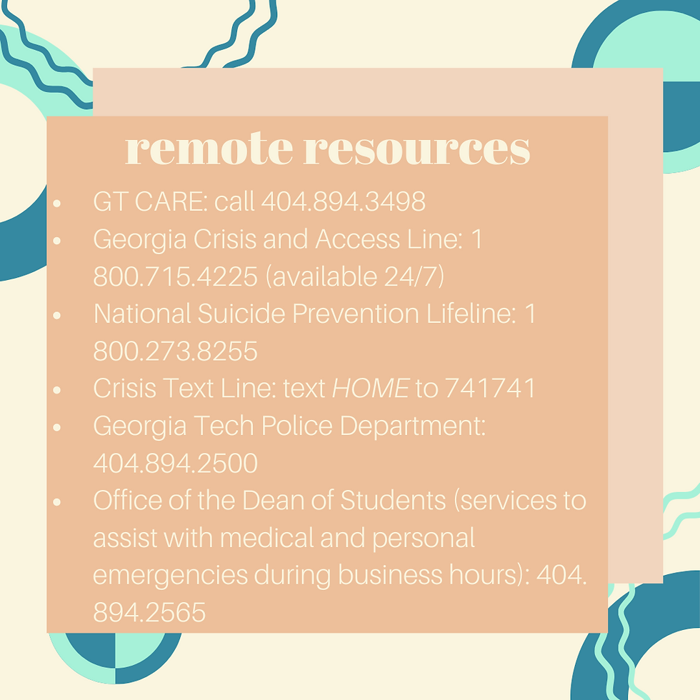
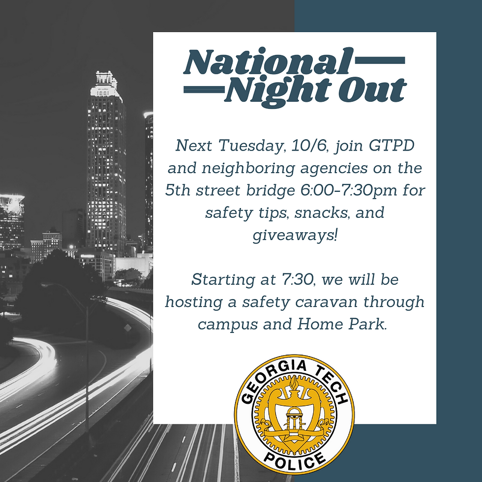
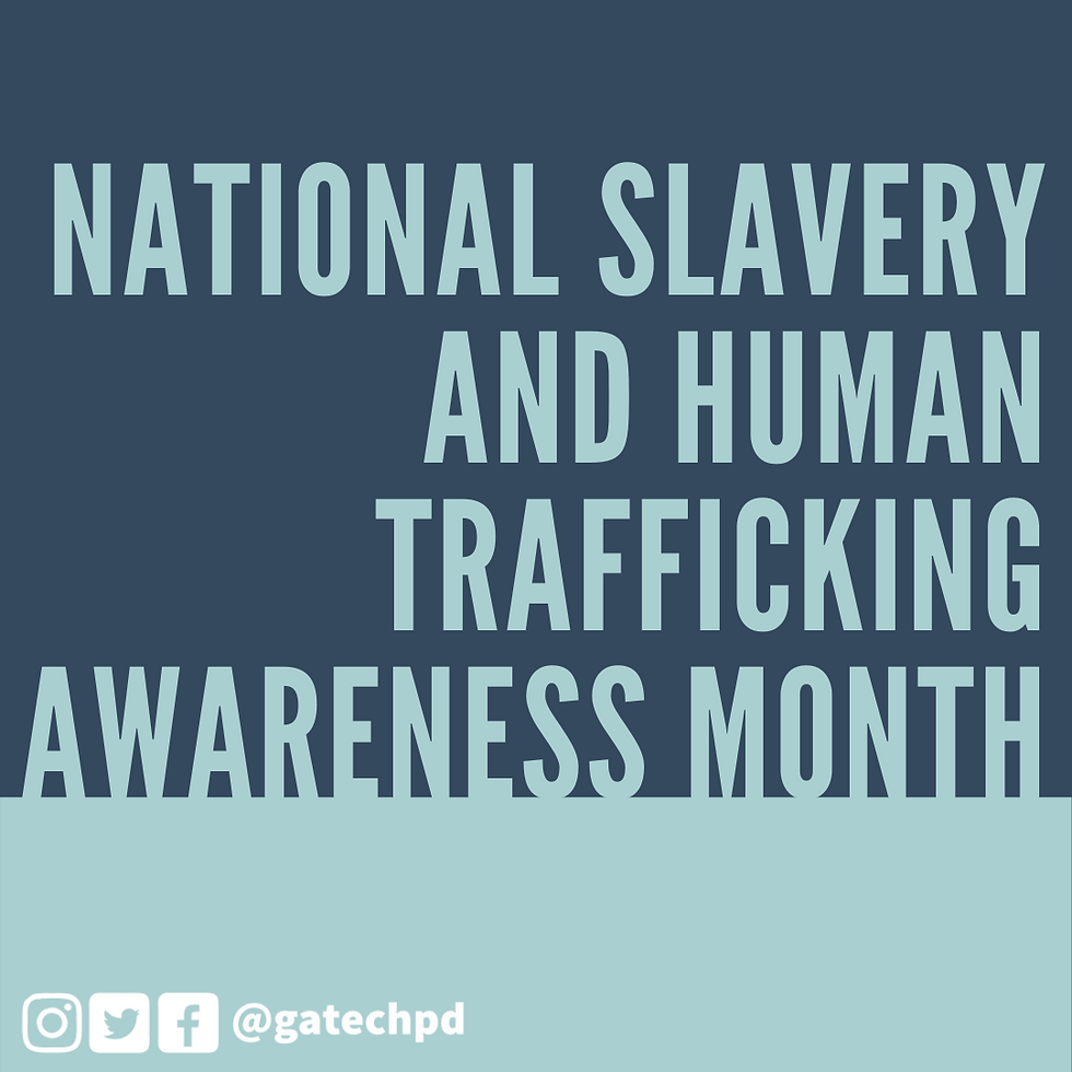
Social Media
These social media graphics were created in Canva, Illustrator, and Procreate for the Georgia Tech Police Department. These graphics were posted on Instagram (@GaTechPD), Facebook (Georgia Tech Police Department), Twitter, and Reddit. My role as a reporter is vital for enabling the police department to connect with students of all backgrounds on Tech's campus. Please feel free to click through the images below, and visit @GaTechPD to see more of my work.

.png)


These social media graphics were created in Canva or Illustrator for the Navigators, an international campus ministry at Georgia Tech. The graphics were posted in instagram (@gtnavs), Facebook (Georgia Tech Navigators), sent out in emails, presented in group chats like GroupMe, and presented in weekly meetings.


Make-A-Wish Georgia
The graphics below are a combination of event flyers and drafts of spreads for MAWGA's Annual Report for Fiscal Year 19. As the creative services intern, I helped with design and wish story writing. Please feel free to click through the images below.


Business Projects
I was commissioned to create the following designs as advertisements for businesses in my hometown. They were made in a combination of Adobe Illustrator and Canva. Click the images to see the full size versions.

This advertisement was a commissioned design for my neighborhood. The design was published in the August 2019 publication of the Georgia Mountain Laurel magazine.

During my time working at Splashe, a pottery studio in my hometown, I assisted the owner with rebranding. She and I worked closely to create a logo that she felt would best represent her creative business.
This advertisement was a commissioned design for my neighborhood. The design was published in the August 2019 publication of the Georgia Mountain Laurel magazine.
The Technique
Referred to as "the South's liveliest college newspaper" since 1945, The Technique provides the Georgia Tech community with weekly updates on sports, campus life, events, jokes, and much more. As a part of the graphic design committee, I created multiple graphics for the sports section and was responsible for a total redesign of advertisement purchase forms.


Academic Projects
These projects were created over the course of two upper level graphic design classes at Georgia Tech. Many of them were created experimentally as I learned the ins and outs of the Adobe Suite, primarily Illustrator and Photoshop.
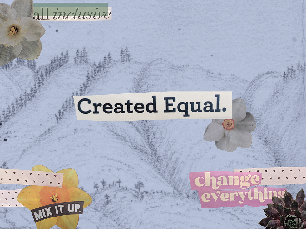
This design is inspired by the trips I have taken to National Parks each summer. Nature has a way of putting you in your place. Without proper preparation, you could easily find yourself soaked up to your ankles in cold glacier water in Banff or without access to air conditioning in the secluded Yosemite Valley. Our environments have a way humbling us, and this collage conveys nature as the great equalizer. When an individual finds themselves in awe of the beauty of the outdoors, it is more obvious than ever that all humans are created equal. The background of the design is a sketch done by John Muir of the Mono-Inyo Crater located in Eastern California. Known as the "father of the national parks" as well as being an unrelenting advocate for conservation it seemed fitting for my art to have a foundation in his work. For the rest of the collage, I used magazine clippings.

I created this piece by using acrylic paints to produce a variety of unique textures using tools like masking tape and a palette knife. After painting 3 different versions of textures, I digitized them and used Illustrator to create masks and turn the textures into fruit. I selected this arrangement of textures and colors to create an atmospheric perspective and a distinct focal point.

This series of speculative future posters was created in collaboration with another student in my major. We drew inspiration from an article in National Geographic that discusses the new technology which allows scientists to better track the harmful pollutants that end up in our freshwater sources. Our designs reflect a soft pastel color scheme contrasts so strongly with the blunt and provocative themes our campaign is promoting. Due to the minimalistic style, we sought uniform gridding across our three posters to promote continuity and cohesive, legitimate organization. This was accomplished through consistent icon and text sizes. Our font choice of a bold, sans-serif text relates a no-nonsense tone that gets right to the point. The iconic images are easy for the general public to interpret and understand, which is vital for the purpose of our campaign to raise awareness.


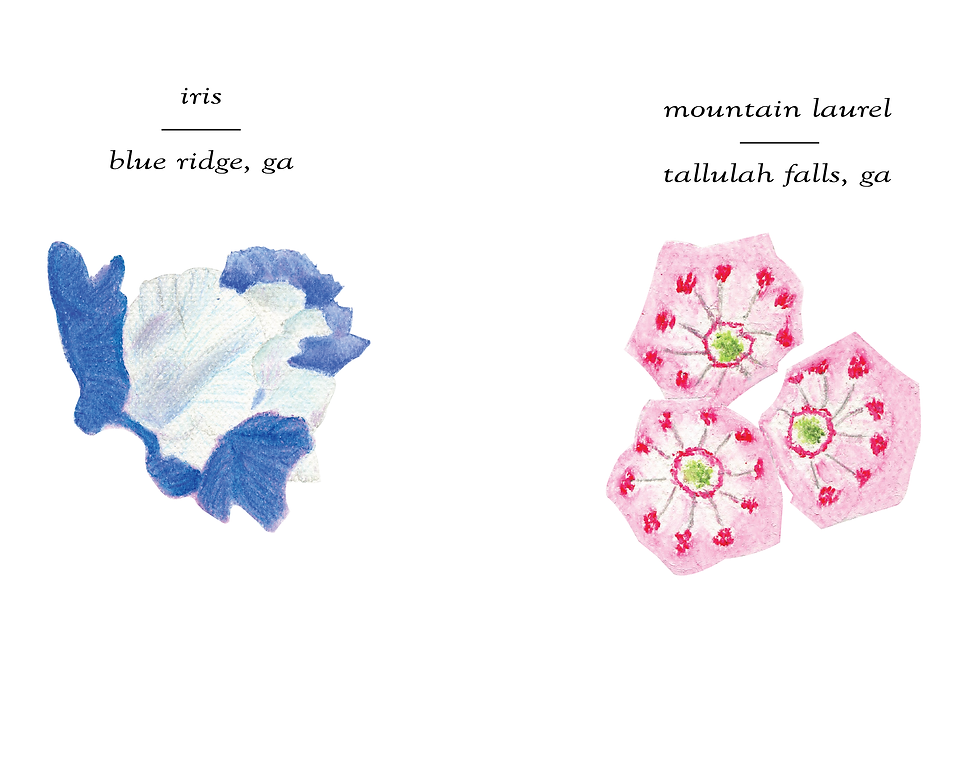
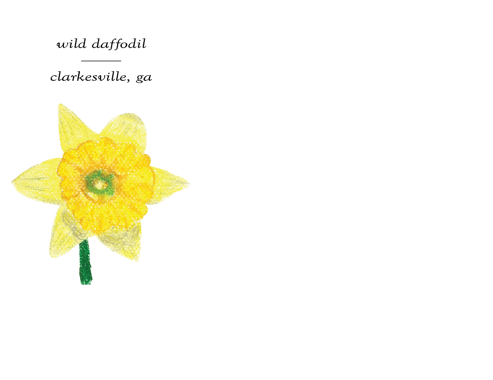
This series of flowers was created for a final project. I selected images of flowers I had taken from around the country. Working from these pictures, I recreated them using oil pastels. After this, I scanned these drawings into the computer and compiled them into a book setup in illustrator. For the final step I printed them out and made them into a short pamphlet.


This series of two images were taken as a part of a project which consisted of learning the principles of photography. I was given the assignment of taking photographs around the Georgia Tech campus.
